Saturday, January 17, 2009

Before and After

Hi again !

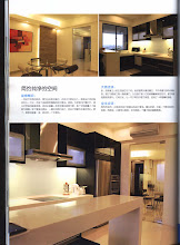
We've recently finished this job in PJ. The job was to renovate a second-hand condo. This family is frequently posted overseas and each posting will require them to stay in their host country for at least a couple of years. As it is, they do not know when or where their next posting will be. The challenge is to renovate the house with minimum spending ( since signs are there that they may need to relocate again next year ) , helping them to prioritise their budget, also to prepare for the eventuality that the unit will be rented out in the near future.

Now, to prepare for a house to be attractive enough for good rental income requires attention on 2 rooms : the kitchen and the bathroom. To minimise spending, we need to use economical materials which is robust enough for the wear and tear of a rental unit. To ensure that the end result will look good is SIMPLY ... CHOOSING THE RIGHT COLOURS.


KITCHEN

The original kitchen was enclosed and the height of the base units were extraordinarily low. No one knows why except guess that the previous tenant must be very short.


WHAT WE DID :
We tore down the wall so that the kitchen now opens up to the living area. The modern kitchen should no longer remain dark and oily and remains hidden from view! We put in soft ambient lightings, use a breakfast counter as a visual border to separate the cooking and the living room.
The lady of the house likes light and soft colours so we used a lot of creams and ivories. The whole room costs RM20,400.
** Feedback from the customer 2 days ago :
She says the breakfast counter is proving to be a " social magnet" - her kids like to gather there and so do her friends when they come over. People like to hang around there for a drink and a chat.


MASTER BEDROOM
There wasn't much hacking here except to remove the old and worn carpet and making over an old and tired looking room.


WHAT WE DID :

We stripped away the old carpet, gave the existing pine floors a good polish and repainted the old set of wardrobes.


** This is the extremely beautiful view from the MBR.


MBR BATHROOM

This MBR bath must have looked as grand as a hotel bath in it's prime but years later as at now, the tiles and everything else look old and requires a thorough makeover.


WHAT WE DID :

We tore down all the tiles, shower, shower screen, sink, wc... We used ivory, grey and black tiles and put in a new long bath. This room costs RM6,600, not inclusive of accessories and tile cost.


SON'S ROOM

We removed the old cabinets from the original position, put in new wardrobe at the opposite wall so that the window area is not covered to allow plenty of light and fresh air in. This room's wardrobe costs RM2,000.


DAUGHTER'S ROOM

The daughter's favourite colour is pink and her mom was initially quite reluctant to use pink as she tried imagining the whole room looking horrendous! If parents cannot afford to indulge in their children's whims and fancies, normally I would recommend something neutral that can be carried into a child's teens. In this case, the parents were very keen to ensure that their kids live an enjoyable and memorable childhood. So I proposed pink to be used only on the focus wall with the rest of the 3 sides ivory with white cabinetry.
This room's wardrobe costs RM4,000.


Tuesday, February 26, 2008

The Psychology of Colour

Today I want to emphasise the importance of colours in our lives, how colours can bring excitement or how harmonious colours bring calm and balance.

When you enter a room, see someone walking toward you on a street, or look up at a billboard while stuck in a traffic jam, the first thing you notice is colour. The yellow walls in a child's room make you smile, the red of a woman's coat catches your eye, the orange background of an advertisement grabs your attention. Would you jump into a swimming pool if the pool is in orange or red? This very clearly tells us how greatly colours affect us.


( summary extracted from the book " The Complete Color Harmony"

RED


- True red is the most vibrant, compelling colour in the spectrum, expressing excitement, speed, power, joy, danger and passion.

- Red attracts immediate attention and brings objects or images to the foreground.

- Red makes people feel warm. Coffee will seem hotter in a red cup than in a blue one.

- Red is the first colour you lose sight of at twilight and is not well seen at a great distance.

- Barn, claret, and crimson reds are considered regal, exclusive, and strong and have great appeal for men.

PEOPLE WHO LIKE RED ARE ...

You crave excitement and like to live in the moment. Easily bored, you also enjoy having the power to get things done quickly. Red lovers are passionate about life.


YELLOW


- Yellow is psychologically the happiest colour in the spectrum, associated with warmth, optimism, and joy.

- Yellow visually pops out at you, making it the most noticeable colour. It's therefore a favourite for signs and product packages.

- Yellow stimulates clear thinking. Black type on a yellow ground is the most legible colour combination and aids in memory retention.

- Yellow adds vitality to other colours, making hot hus appear even more brilliant and bringing cool colours to life.

- Overexposure to bright yellow can be unsettling. Paler hues are better for socializing, whereas gold tones signify wealth.


PEOPLE WHO LIKE YELLOW ARE ...

You are generally happy, playful, and optimistic. If something isn't working in your life, you quickly seek to change it. Spontaneous, you have boundless curiosity.


ORANGE

- Orange is stimulating, energizing colour that appears friendly, outgoing, cheerful and adventurous.
- Bright orange has a very high visibility, making it ideal for warning signals or grabbing attention, even when used in small amounts.

- Easier on the eye, autumnal and spicy oranges are warm, exotic, and appetizing, while peach tones are most flattering to the skin.

- People who wear orange are thought to be creative, enthusiastic, and fun to be with, but possibly also a bit irresponsible.

- Because of its playful, active qualities, orange is a favourite of children, teens, and athletes.


PEOPLE WHO LIKE ORANGE ARE ...

You are gregarious, dynamic and fun to be with. Flamboyant by nature, you don't mind sticking out in a crowd. You have a great appetite for life and food.


GREEN

- Pale green is physically the most relaxing and calming colour in the spectrum. As the easiest colour on the eye, it can improve vision.

- Vibrant greens remind people of the spring, nature, life, and youthful energy.

- Darker greens are associated with stability and growth, suggesting high economis status and success.

- Green is the worldwide symbol for safety. Green also means go.

- People who wear green are thought to be kind, dependable, and generous.


PEOPLE WHO LIKE GREEN ARE ...

You long to feel safe and make the world a better place for others. You are generous with your time and goodwill, but also can be stubborn about issues that are important to you.


BLUE

- Blue is the best liked of all colours and is a particular favourite of men.

- Practically all our associations with blue are positive, making it an uplifting and peaceful colour.

- Navy blue commands respect, representing loyalty, trustworthiness, fidelity, and integrity.

- Blue can make a space appear larger, and time seems to pass more slowly in its presence.

- Deep blue is associated with opulence in many cultures, and when you are the best, you get a "blue ribbon".


PEOPLE WHO LIKE BLUE ARE ...

You like a sense of calm and order in your life. Trustworthy, you also value loyalty in others. Sky blue attracts pleasure-seekers and daydreamers, while navy appeals to the serious and conservative.


PURPLE

- Royal purple exudes class, power, passion, sensuality, and luxury.

- Deep plum is spiritual and mysterious, with a serious dignified quality.

- Lavenders and violets have a sweet, romantic, and nostalgic appeal.

- People tend to get less work done in purple rooms because the colour encourages daydreaming.

- Women often cite purple as their favourite colour.


PEOPLE WHO LIKE PURPLE ARE ...

You are known as a negotiator and have a strong desire to please. Though well-liked, you don't confide easily in others and enjoy a slight sense of mystery.


PINK

- Pink is the most passive of all colours, promoting affability while discouraging aggression against oneself as well as others.

- Considered the most feminine colour, pink is associated with nurturing and compassion.

- Pink calms and soothes, and is thought to aid in digestion.

- Shocking pink has a much higher concentration of red, making it appear energetic, fun and trendy.
- Men prefer peachy pinks to mauvey ones.


PEOPLE WHO LIKE PINK ARE ...

You are sensitive and kind, with a sweet disposition. You wouldn't mind a return to more innocent times and crave romance in your life.


BROWN

- Brown is a warm, comforting colour associated with the earth, trees, hearth, and home.

- People tend to buy big-ticket products in neutral colours, especially in an uncertain economy. Browns both put consumers at ease and are considered timeless.

- Brown has a common feel in clothing, making one look approachable, reliable and sincere.

- Brown has a masculine, rugged quality that particularly appeals to men.

- Paper-bag brown is used in packaging to denote a natural product.

PEOPLE WHO LIKE BROWN ARE ...

You are a down-to-earth and a dependable, loyal friend. Your home and family are very important to you and comfort is the key issue in life.


GRAY

- Gray represents non-involvement, giving it a formal, dignified, and conservative authority.

- Unlike neutral brown, gray lacks warmth, which can make it appear remote, solemn, and a bit gloomy when used alone.

- Gray is associated with wisdom and maturity, adding to its moneyed appeal.

- Metallic grays offer the promise of scientific and technological advances, as well as a sense of speed and competence.

- Grays are cool and restful in home decor, but also discourage lively conversation and offer an unattractive backdrop for food.


PEOPLE WHO LIKE GRAY ARE ...

You are a watcher rather than a participator and are reserved in social situations. Generally noncommittal, you don't like to firm up plans until the very last moment.


WHITE
- White symbolizes purity, innocence, goodness and truth.

- Even though white is neutral, it is considered a cool colour because of its association with snow and ice.

- White is often thought to suggest simplicity, sterility, and safety.

- White is popular on the packaging of dairy products, low-fat items, and refined ingredients such as sugar and flour.


BLACK

- Black, the most authoritative, intimidating colour, can appear agggressive when overused.

- Black is considered conservative, serious, and dignified and is used to show respect at solemn and formal occasions.

- Black gives a feeling of weight and depth. People think black boxes weigh more than white ones.

- Text is difficult to read against a black background.