
This young loving couple wanted a cozy fuss-free abode, a haven to return to after long working hours. Indeed modern working couples certainly do not want to waste too much time cleaning up when things can be kept simple, neat and yet look good.
Designed by Tim, the concept had to be modern using grey as the couple's favourite colour - emphasising on various grey tones and yet not to end up looking stark cold and unfriendly.

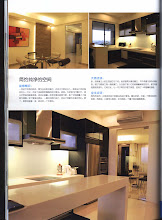
The developer planned this area to be a dining area. However, the owners were receptive to the idea of combining the dining function into the dry kitchen peninsular. This new urban concept is space saving and functional. Not only does the dry kitchen look good enough to dine in, but the lady-owner gets extra storage compared to the other option if they had just put in a normal dining table.
And modern top quality Acrylic tops like this LG set doesn't stain, so there's no worry about yellow stains of curry or kunyit. Another plus point is that higher range tops are homogeneous, therefore it can be repolished again in a few years time.


 Notice that the large decorative glass makes the whole area "open up", and I especially want to highlight that the owners have cleverly placed a painting on the opposite side of the wall so that the reflection is caught in the mirror. I also want to highlight that lady-owner had a good sense of colour to choose green to bring "life" to the cold greys. Notice the greens from the placemats, the glass decorative sink, the poster, the glass bottles and bits of green appearing in other parts of the room.
 Tips :
1) Mirrors put everything into focus - If placed in front of beautiful features like pendant lights or a potted plant or a nice scene, the beauty is magnified twice. If wrongly placed in front of toilet doors or stairs or a dark walkway, the eyesore again is magnified.
2) Choosing an outstanding focal colour - While we always plan all the colours to blend in harmoniously, too much colours and shades of the same family can be overly bland or boring. Choose a shade on the opposite of the colour wheel to bring some zing and excitement to the eyes. In this example of a grey environment, focus colours can be chilli red, or sunkist orange or leaf green as the owners have succesfully used here.


In every house I go to, I look for nick nacks such as this! This is what differentiates a home from a showroom - personal collections that define your personality.


Tim and I are just amazed with this EXTREMELY NEAT walk-in wardrobe! The users must be extremely disciplined!
Wardrobe tip :
While an open walk-in wardrobe looks good in a showroom, do you realise that they look good in showroom because the displayed clothes are all in one colour and all are of equal size. Without the discipline to keep things neat, an open wardrobe is not such a good idea.
 The Wet Kitchen uses Pigment Matt Graphite with Magic Glass and LG acrylic top, while the Dry Kitchen uses Crystal Gloss and LG acrylic top. Total cost is around RM30,000. The wardrobe comes FREE during June 2010 promotion.
 Our goal at the end of every project is to have customers who end up a friends! Here are Wei Ling, our designer Tim and Freddie!
“ After comparing your price with other IDs, I find the quotation reasonable, in terms of the good quality material, super workmanship and of course the great design! We selected Meridian because of great recommendation from our friends and also because of the very good customer service and professionalism.
We have used other contractors before but we had a lot of misunderstandings and some disappointments. Meridian has been a great help and there is lesser hassle and worry-free. We are very happy with our engagement of Meridian.
We would absolutely recommend Meridian to our friends and family! In one word, Meridian is Professional! “
Chin Wei Ling
IT Business Systems Manager
DELL Global Business Centre


