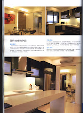


Press Release : This project was selected to be featured in Designer Concept Oct '09 issue simply for the reason that it's a very daring play of colours!

I love this home! The lady owner loves flamboyant colours and this experimentation of colours really makes this home very different from the rest. The pictures here show how exciting new colours can totally transform a tired looking second-hand condo.


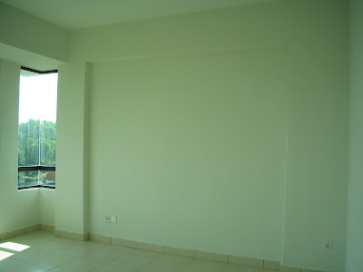
The available wall space in the living area is for the owner's collection of books and memorabilia from her travels. As someone who is active and believes in nurturing the mind through reading during quiet time, she does not own a tv set so there is no need for a tv cabinet.


The owner loves brightness so we took out the kitchen door and replaced it with aluminium louvre door with wider gaps to allow plenty of fresh air and light. She chose not to use a separate dining table but to turn the island unit into something multi-functional - for dining, work-area with plug point for a laptop and with some storage beneath. Why want to have a breakfast counter, a work table and also a dining table when you can combine all and save premium space?


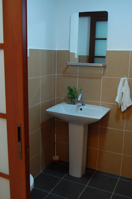
She removed the bathroom door to be replaced with frosted glass sliding to allow natural brightness in. For those who are hesitating…it's okay to have frosted glass as toilet door, no one can see inside.


The HOBBY AREA
A diver as well as a hobby photographer, she turned both walkways to the MBR and the other rooms into a display area for her photos.


I love this home! The lady owner loves flamboyant colours and this experimentation of colours really makes this home very different from the rest. The pictures here show how exciting new colours can totally transform a tired looking second-hand condo.
The MASTER BEDROOM
This ardent diver loves to bring the colour of the big blue ocean into her bedroom. She asked to have an open bathroom by removing the door and removed the tired bathtub to be replaced with a shower.


The available wall space in the living area is for the owner's collection of books and memorabilia from her travels. As someone who is active and believes in nurturing the mind through reading during quiet time, she does not own a tv set so there is no need for a tv cabinet.


The owner loves brightness so we took out the kitchen door and replaced it with aluminium louvre door with wider gaps to allow plenty of fresh air and light. She chose not to use a separate dining table but to turn the island unit into something multi-functional - for dining, work-area with plug point for a laptop and with some storage beneath. Why want to have a breakfast counter, a work table and also a dining table when you can combine all and save premium space?


She removed the bathroom door to be replaced with frosted glass sliding to allow natural brightness in. For those who are hesitating…it's okay to have frosted glass as toilet door, no one can see inside.


The HOBBY AREA
A diver as well as a hobby photographer, she turned both walkways to the MBR and the other rooms into a display area for her photos.


